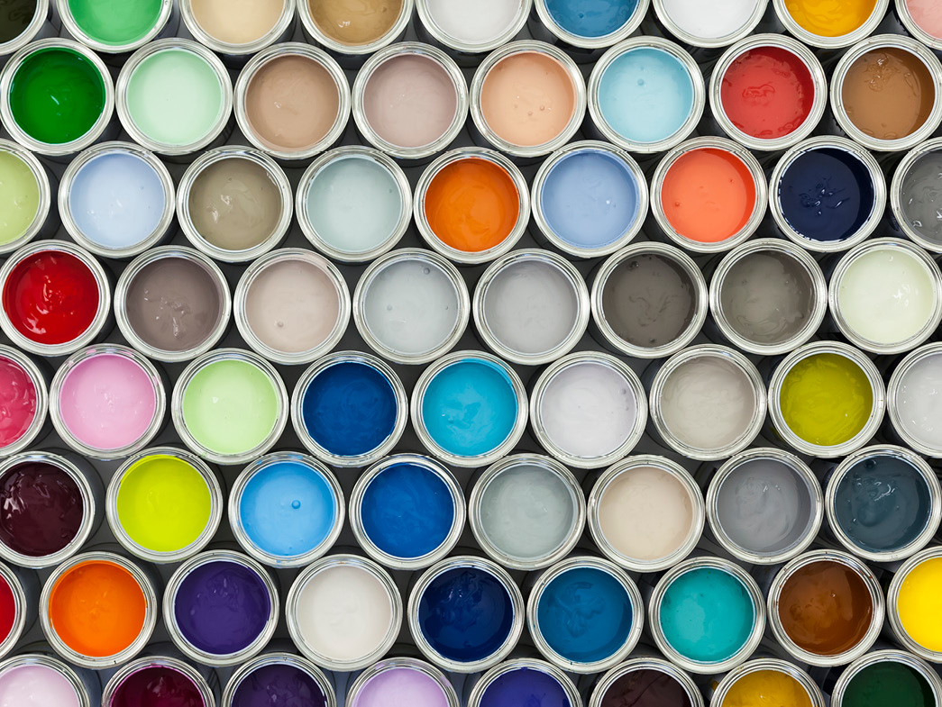
An infusion of color can transform a space or even an entire home. Experimenting can show off your personal style, but can be a little risky, as it’s not always easy to pick the perfect palette. Use these tips to get inspired, and begin thinking like a designer!
Understand the Basics
The best color for a space depends on light, textures, things you already own, and the way one room flows into the next. When choosing a color, consider the lighting and how it shifts throughout the day. Even the type of light bulb you choose will change the look.

Navigate the Color Wheel
The color wheel is the best (and easiest) way for both beginners and experts to choose color schemes that work.
The classic color wheel is made up of 12 different hues. These hues are classified into 3 categories:
- Primary colors (3) are the root of all colors and are the only hues that can’t be created by mixing any colors together (yellow, red, and blue).
- Secondary colors (3) are created by combining two primary colors to get either purple, green, or orange.
- Tertiary colors (6) come from mixing a primary color with its secondary color neighbor.
These 12 basic colors allow you to mix endless combinations of hues. For even more variety, try incorporating white (to tint), black (to shade), or gray (to create tones) into your color palette.
With these endless possibilities, how do you choose even one color, let alone a palette for your home? Use the suggestions below for inspiration!

Classic Color Combinations
Monochromatic Color Combination: Love a color—own it
Monochromatic rooms are peaceful, allowing the eye to move easily without interruption by other colors. Contrast is created by using tints, shades, or tones of the same hue. In the examples, one hue is muted to a neutral, and then brightened up as an accent to keep it all in the family.
Analogous Color Combinations: The friendliest neighbors
Analogous colors lead to soft, transitioning palettes that blend and change seamlessly. Often resembling nature’s palettes—think of sunsets or ocean waves—an analogous color scheme is made up of two or more neighboring colors.
Complementary Color Combinations: Opposites attract
Choose two colors that are directly opposite each other on the wheel for a complementary color combination. The contrast creates interest and energy but remains sensible and pleasing to the eye.
- yellow and purple.
- blue and orange.
- red and green.
Triadic Color Combinations: Equally balanced trios for the bold and vibrant
When strong contrast exists, balance is key. Choose three equally spaced colors on the wheel for a color scheme that’s both bold and balanced.
- Red, yellow, and blue.
- Purple, green, and orange.
- Blue-purple, red-orange, and yellow-green.
Split Complementary Color Combinations: Almost opposites attract
Almost complementary colors are grouped together for a more subtle effect in this color combination. To achieve, select a base color, find its complement, and then incorporate the hues to the right or left of the base color’s complement.
- Red, blue-green, and yellow-green.
- Blue, red-orange, and yellow-orange.
- Yellow, blue-purple, and red-purple.
- Purple, yellow-orange, and yellow-green.
Practical Tips for Your Home
Blend rather than match.
Every element in a chosen color shouldn’t match exactly. Use the entire family of tones, tints, and shades throughout the room (for example, a vase that’s a tint of the wall color). Variations keep rooms from looking over designed.
Neutralize for balance.
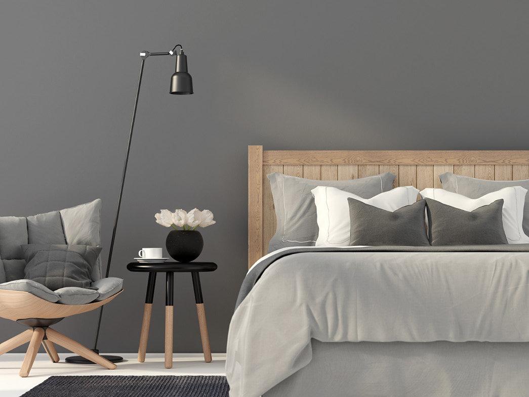
Lots of brights? Add a neutral color to balance it out. Or start with a neutral scheme, and add pops of colorful accents.
Here are some of the best neutrals according to designers to try samples of on your wall
- Nimbus, Benjamin Moore.
- Lake Placid, Benjamin Moore.
- Agreeable Gray, Sherwin Williams.
- Applesauce Cake, PPG.
- Decorator’s White, Benjamin Moore.
- Slipper Satin, Farrow & Ball.
Find a pattern.
What about a favorite photo, piece of artwork, or sweater? Is there a pattern in the colors you are naturally drawn to? This will help you establish where you want to begin.
Brighten dark rooms.
In low-light rooms, shadows become distinct, making a space feel even darker. Choose a color that absorbs shadows to brighten it up. Contrary to what you may think, light colors won’t work; try a saturated, rich hue, like a jewel tone. Dark rooms allow you to experiment—even if the color looks too bright, super-saturated colors mellow in shadows.
- Emerald green
- Ruby red
- Royal blue
- Dark purple
Create color illusion.
Paint two adjacent rooms the same color to give the appearance of an open floor plan. Use the same colors and patterns in the master bedroom and bath to create an en suite feel.
Remember existing considerations.
Don’t forget to factor in woodwork, furniture, flooring, or countertops. Choose colors that will work with those elements already in place. The same advice can be said when choosing home accents and new furniture. Use our printable Color Guide as an on-the-go resource for your home’s color palette when you spot that perfect shade of fabric or other home accent.
Here’s what’s trending.
Choose a palette with Pantone’s Color of the Year, Rose Quartz and Serenity. Joined together, Rose Quartz and Serenity demonstrate an inherent balance between a warmer embracing rose tone and the cooler tranquil blue.
Dial down.
Tone down color schemes by adding white to create tints of bold colors. Even a primary palette can be muted enough to look elegant and not elementary.
Not ready to commit?
If you are worried about being overwhelmed by color, use it in smaller doses to accent rather than dominate. Accent with colorful accessories and artwork to see how much you enjoy living with a certain hue.